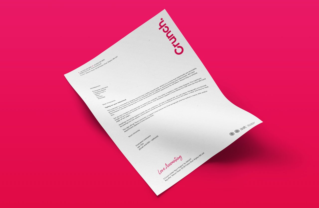
Crunch

Love accounting
Client

Crunch

Services

Brand Refresh, Brand strategy, Print, Interior

The Story

Bring back the love

Having worked with Crunch many years ago it was amazing to work with them again and see their progress. Crunch had achieved a huge amount but had also lost a little love for their brand. We helped them bring it back. Literally.

At one time Crunch used Love Accounting as their strapline. In a previous rebrand, they had lost the strapline to make way for a broadening in service. Now they realised getting back and explaining their core offer was more important.

The Strategy

Studio Kidd ran a brand workshop to define values, Mission, Why, Brand Principles, Brand Promise and brand vision. We also worked through a positioning statement and an overarching ‘Why’.

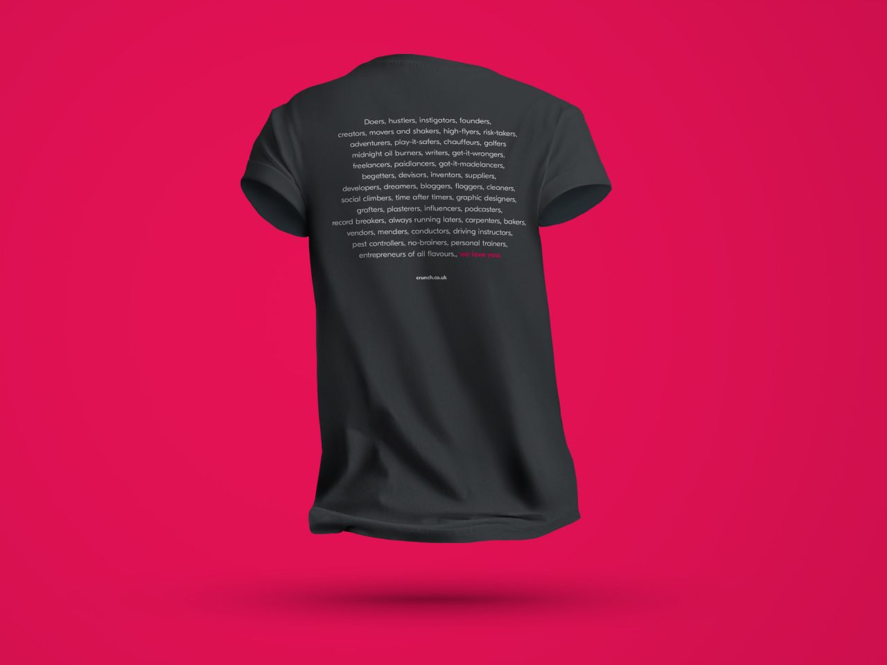
Studio Kidd visualised the Brand Principles in the brand document and went as far as writing a poem that captures the brand’s base audience and Crunch’s passion for that market.

The outcomes

Based on the agreed strategy Studio Kidd worked up some brand updates to visually reflect the brand better. We brought out the passion with the new (old) strapline Love Accounting depicted in a handwritten form which fits snugly in with their existing logotype.

We also introduced new patterns, illustration and a version of the logo that works in a circle.

Patterns

We developed a library of patterns to add texture based on mathematical signs

Strapline

We fitted a hand-drawn strapline so snugly with the existing logotype that it looks like it was always there. The balance of geometric sanserif type and had drawn strapline works and conveys the passion that the Crunch team possess.